Tailwind Plus 中有许多 UI 模块需要 JavaScript 才能真正发挥作用,比如对话框、下拉菜单、命令面板等等。如果您不是 React 或 Vue 用户,以前使用这些 UI 模块就意味着必须自己编写所有那些复杂的 JavaScript 代码。
今天这一切终于改变了——Tailwind Plus 中的每个 UI 模块现在都完全可用、无障碍且具备交互功能,包括纯 HTML 示例。
现在,您可以在任何项目中使用任意 下拉菜单、命令面板、对话框、抽屉 等,无需任何 JavaScript 框架。
无需框架
为实现这一点,我们构建了 @tailwindplus/elements —— 这是一个专门为 Tailwind Plus 用户发布的库。
Elements 是一组无界面(headless)的 自定义元素,封装了构建交互式自定义 UI 需要的所有复杂行为,仅用 HTML 即可实现,样式可以用工具类或自定义 CSS 任意调整。
这些自定义元素不依赖特定的 JavaScript 框架,能在任何能使用 <script> 标签的地方运行:
<script src="https://cdn.jsdelivr.net/npm/@tailwindplus/elements@1" type="module"></script>下面是用 Elements 构建一个 自定义下拉菜单 的示例:
<el-dropdown class="relative inline-block text-left"> <button class="inline-flex w-full justify-center gap-x-1.5 rounded-md bg-white px-3 py-2 text-sm font-semibold text-gray-900 shadow-xs ring-1 ring-gray-300 ring-inset hover:bg-gray-50"> Options <svg viewBox="0 0 20 20" fill="currentColor" aria-hidden="true" class="-mr-1 size-5 text-gray-400"> <path d="M5.22 8.22a.75.75 0 0 1 1.06 0L10 11.94l3.72-3.72a.75.75 0 1 1 1.06 1.06l-4.25 4.25a.75.75 0 0 1-1.06 0L5.22 9.28a.75.75 0 0 1 0-1.06Z" clip-rule="evenodd" fill-rule="evenodd" /> </svg> </button> <el-menu anchor="bottom end" popover class="w-56 origin-top-right rounded-md bg-white shadow-lg ring-1 ring-black/5 transition transition-discrete [--anchor-gap:--spacing(2)] focus:outline-hidden data-closed:scale-95 data-closed:transform data-closed:opacity-0 data-enter:duration-100 data-enter:ease-out data-leave:duration-75 data-leave:ease-in"> <div class="py-1"> <a href="#" class="block px-4 py-2 text-sm text-gray-700 focus:bg-gray-100 focus:text-gray-900 focus:outline-hidden">账号设置</a> <a href="#" class="block px-4 py-2 text-sm text-gray-700 focus:bg-gray-100 focus:text-gray-900 focus:outline-hidden">支持</a> <a href="#" class="block px-4 py-2 text-sm text-gray-700 focus:bg-gray-100 focus:text-gray-900 focus:outline-hidden">许可证</a> <form action="#" method="POST"> <button type="submit" class="block w-full px-4 py-2 text-left text-sm text-gray-700 focus:bg-gray-100 focus:text-gray-900 focus:outline-hidden">登出</button> </form> </div> </el-menu></el-dropdown>下面是创建一个 自定义选择框 的示例:
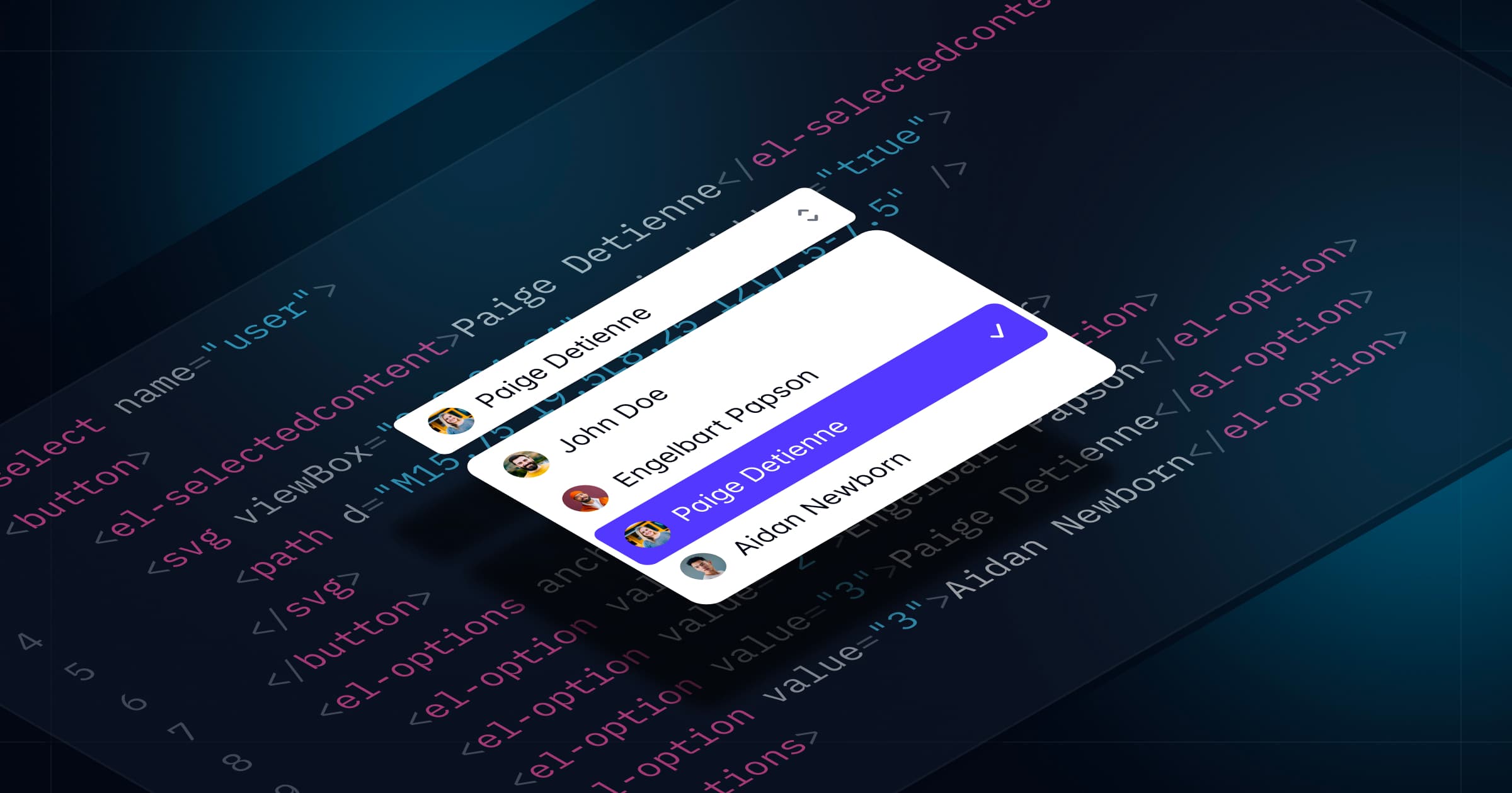
<label for="select" class="block text-sm/6 font-medium text-gray-900">分配给</label><el-select id="select" name="selected" value="4" class="mt-2 block"> <button type="button" class="grid w-full cursor-default grid-cols-1 ..."> <el-selectedcontent></el-selectedcontent> <svg viewBox="0 0 16 16" fill="currentColor" aria-hidden="true" class="col-start-1 row-start-1 ..."> <!-- ... --> </svg> </button> <el-options anchor="bottom start" popover class="max-h-60 w-(--button-width) [--anchor-gap:--spacing(1)] ..."> <el-option value="1" class="group/option relative block focus:bg-indigo-600 ..."> <div class="flex items-center"> <span aria-hidden="true" class="inline-block size-2 shrink-0 ..."></span> <span class="ml-3 block group-aria-selected/option:font-semibold ..."> Wade Cooper <span class="sr-only"> 在线</span> </span> </div> <span class="group-not-aria-selected/option:hidden group-focus/option:text-white in-[el-selectedcontent]:hidden ..."> <svg viewBox="0 0 20 20" fill="currentColor" aria-hidden="true" class="size-5"> <!-- ... --> </svg> </span> </el-option> <!-- ... --> </el-options></el-select>看到这些像 <el-select> 和 <el-options> 这样的自定义 HTML 元素了吗?它们就是实现所有功能的秘诀,包括自动 ARIA 属性管理、焦点处理、键盘支持等等。
您甚至可以用 Elements 构建一个和 命令面板 一样复杂的功能,而无需自己写任何 JavaScript:
<button command="show-modal" commandfor="dialog" class="rounded-md bg-white/80 px-2.5 py-1.5 text-sm font-semibold text-gray-900 hover:bg-white/90"> 打开命令面板</button><el-dialog> <dialog id="dialog" class="backdrop:bg-transparent"> <el-dialog-backdrop class="fixed inset-0 bg-gray-500/25 transition-opacity data-closed:opacity-0 data-enter:duration-300 data-enter:ease-out data-leave:duration-200 data-leave:ease-in"></div> <div tabindex="0" class="fixed inset-0 w-screen overflow-y-auto p-4 focus:outline-none sm:p-6 md:p-20"> <el-dialog-panel class="mx-auto block max-w-3xl transform overflow-hidden rounded-xl bg-white shadow-2xl ring-1 ring-black/5 transition-all data-closed:scale-95 data-closed:opacity-0 data-enter:duration-300 data-enter:ease-out data-leave:duration-200 data-leave:ease-in"> <el-command-palette class="divide-y divide-gray-100"> <div class="grid grid-cols-1"> <input type="text" autofocus placeholder="搜索..." class="col-start-1 row-start-1 h-12 w-full pr-4 pl-11 text-base text-gray-900 outline-hidden placeholder:text-gray-400 sm:text-sm" /> <svg viewBox="0 0 20 20" fill="currentColor" aria-hidden="true" class="pointer-events-none col-start-1 row-start-1 ml-4 size-5 self-center text-gray-400"> <path d="M9 3.5a5.5 5.5 0 1 0 0 11 5.5 5.5 0 0 0 0-11ZM2 9a7 7 0 1 1 12.452 4.391l3.328 3.329a.75.75 0 1 1-1.06 1.06l-3.329-3.328A7 7 0 0 1 2 9Z" clip-rule="evenodd" fill-rule="evenodd" /> </svg> </div> <div class="flex transform-gpu divide-x divide-gray-100"> <div class="max-h-96 min-w-0 flex-auto scroll-py-4 overflow-y-auto px-6 py-4"> <el-command-list class="-mx-2 block text-sm text-gray-700"> <el-defaults> <h2 class="mx-2 mt-2 mb-4 text-xs font-semibold text-gray-500">最近搜索</h2> <div class="text-sm text-gray-700"> <a id="person-suggestion-6" href="#" class="group flex cursor-default items-center rounded-md p-2 select-none focus:outline-hidden aria-selected:bg-gray-100 aria-selected:text-gray-900"> <img src="https://images.unsplash.com/photo-1472099645785-5658abf4ff4e?ixlib=rb-1.2.1&ixid=eyJhcHBfaWQiOjEyMDd9&auto=format&fit=facearea&facepad=2&w=256&h=256&q=80" alt="" class="size-6 flex-none rounded-full" /> <span class="ml-3 flex-auto truncate">Tom Cook</span> <svg viewBox="0 0 20 20" fill="currentColor" aria-hidden="true" class="ml-3 hidden size-5 flex-none text-gray-400 group-aria-selected:block"> <path d="M8.22 5.22a.75.75 0 0 1 1.06 0l4.25 4.25a.75.75 0 0 1 0 1.06l-4.25 4.25a.75.75 0 0 1-1.06-1.06L11.94 10 8.22 6.28a.75.75 0 0 1 0-1.06Z" clip-rule="evenodd" fill-rule="evenodd" /> </svg> </a> <!-- ... --> </div> </el-defaults> <el-command-group hidden class="sm:h-96"> <a id="person-1" href="#" hidden class="group flex cursor-default items-center rounded-md p-2 select-none focus:outline-hidden aria-selected:bg-gray-100 aria-selected:text-gray-900"> <img src="https://images.unsplash.com/photo-1494790108377-be9c29b29330?ixlib=rb-1.2.1&ixid=eyJhcHBfaWQiOjEyMDd9&auto=format&fit=facearea&facepad=2&w=256&h=256&q=80" alt="" class="size-6 flex-none rounded-full" /> <span class="ml-3 flex-auto truncate">Leslie Alexander</span> <svg viewBox="0 0 20 20" fill="currentColor" aria-hidden="true" class="ml-3 hidden size-5 flex-none text-gray-400 group-aria-selected:block"> <path d="M8.22 5.22a.75.75 0 0 1 1.06 0l4.25 4.25a.75.75 0 0 1 0 1.06l-4.25 4.25a.75.75 0 0 1-1.06-1.06L11.94 10 8.22 6.28a.75.75 0 0 1 0-1.06Z" clip-rule="evenodd" fill-rule="evenodd" /> </svg> </a> <!-- ... --> </el-command-group> </el-command-list> <el-no-results hidden class="block px-6 py-14 text-center text-sm sm:px-14"> <svg viewBox="0 0 24 24" fill="none" stroke="currentColor" stroke-width="1.5" aria-hidden="true" class="mx-auto size-6 text-gray-400"> <path d="M15 19.128a9.38 9.38 0 0 0 2.625.372 9.337 9.337 0 0 0 4.121-.952 4.125 4.125 0 0 0-7.533-2.493M15 19.128v-.003c0-1.113-.285-2.16-.786-3.07M15 19.128v.106A12.318 12.318 0 0 1 8.624 21c-2.331 0-4.512-.645-6.374-1.766l-.001-.109a6.375 6.375 0 0 1 11.964-3.07M12 6.375a3.375 3.375 0 1 1-6.75 0 3.375 3.375 0 0 1 6.75 0Zm8.25 2.25a2.625 2.625 0 1 1-5.25 0 2.625 2.625 0 0 1 5.25 0Z" stroke-linecap="round" stroke-linejoin="round" /> </svg> <p class="mt-4 font-semibold text-gray-900">未找到用户</p> <p class="mt-2 text-gray-500">未找到匹配的内容,请重试。</p> </el-no-results> </div> <el-command-preview for="person-1" hidden class="h-96 w-1/2 flex-none flex-col divide-y divide-gray-100 overflow-y-auto sm:flex"> <div class="flex-none p-6 text-center"> <img src="https://images.unsplash.com/photo-1494790108377-be9c29b29330?ixlib=rb-1.2.1&ixid=eyJhcHBfaWQiOjEyMDd9&auto=format&fit=facearea&facepad=2&w=256&h=256&q=80" alt="" class="mx-auto size-16 rounded-full" /> <h2 class="mt-3 font-semibold text-gray-900">Leslie Alexander</h2> <p class="text-sm/6 text-gray-500">联合创始人 / CEO</p> </div> <div class="flex flex-auto flex-col justify-between p-6"> <dl class="grid grid-cols-1 gap-x-6 gap-y-3 text-sm text-gray-700"> <dt class="col-end-1 font-semibold text-gray-900">电话</dt> <dd>1-493-747-9031</dd> <dt class="col-end-1 font-semibold text-gray-900">网址</dt> <dd class="truncate"><a href="https://example.com" class="text-indigo-600 underline">https://example.com</a></dd> <dt class="col-end-1 font-semibold text-gray-900">邮箱</dt> <dd class="truncate"><a href="mailto:lesliealexander@example.com" class="text-indigo-600 underline">lesliealexander@example.com</a></dd> </dl> <button type="button" class="mt-6 w-full rounded-md bg-indigo-600 px-3 py-2 text-sm font-semibold text-white shadow-xs hover:bg-indigo-500 focus-visible:outline-2 focus-visible:outline-offset-2 focus-visible:outline-indigo-600">发送消息</button> </div> </el-command-preview> <!-- ... --> </div> </el-command-palette> </el-dialog-panel> </div> </dialog></el-dialog>为了支持 Tailwind Plus 中所有 UI 模块,这个 Elements 首个版本中包含了以下基础组件:
- 自动完成—— 用于构建自定义的 组合框。
- 命令面板—— 用于构建自定义的 命令面板。
- 对话框—— 用于自定义 模态对话框、抽屉 等。
- 可展开内容—— 用于构建可折叠的 常见问题、移动端菜单(在 导航栏中)等。
- 下拉菜单—— 用于构建自定义的 下拉菜单。
- 弹出框—— 用于构建自定义的 飞出菜单等。
- 选择框—— 用于构建自定义的 选择菜单。
- 选项卡—— 用于构建自定义选项卡,就像我们在自定义 多行文本框和产品概览中使用的那样。
如果您是 Tailwind Plus 用户,请访问全新的 Elements 文档 了解详细原理并查看示例。
利用现代 Web 技术
我们大量依赖现代平台特性,确保 Elements 轻量且尽可能原生高效。
- 使用 自定义元素 作为跨平台组件抽象。
- 利用
popover属性 管理弹出层和弹出框,配合beforetoggle控制过渡动画。 - 使用原生的
<dialog>元素实现焦点锁定和顶层渲染。 - 通过 Invoker 命令 声明式管理交互元素,比如切换自定义折叠内容。
- 利用
ElementInternals实现自定义表单控件与原生表单控件一样的行为。
我们还打包了这些特性所需的所有 polyfill,确保 Elements 能在所有 Tailwind CSS v4.0 支持的浏览器中正常运行。随着现代平台特性的普及,Elements 会变得更加轻量。
适用于所有环境的组件
HTML 是所有 Web 框架间的最低公共分母,Elements 让所有仅用 HTML 的 Tailwind Plus UI 模块都能在任何地方运行。
下面是我们一个带双向绑定的 组合框 示例,使用的是 Svelte:
<script> let input = $state(""); function handleSubmit() { alert(`已选中: ${input}`); }</script><form onsubmit={handleSubmit}> <label for="autocomplete" class="block text-sm/6 font-medium text-gray-900">分配给</label> <el-autocomplete class="relative mt-2 block"> <input bind:value={input} id="autocomplete" type="text" class="block w-full rounded-md ..." /> <button type="button" class="absolute inset-y-0 right-0 flex ..."> <svg viewBox="0 0 20 20" fill="currentColor" aria-hidden="true" class="size-5 text-gray-400"> <path d="M5.22 8.22a.75.75 ..." clip-rule="evenodd" fill-rule="evenodd" /> </svg> </button> <el-options anchor="bottom end" popover class="max-h-60 w-(--input-width) [--anchor-gap:--spacing(1)] ..."> <el-option value="Leslie Alexander" class="block truncate aria-selected:bg-indigo-600 aria-selected:text-white ...">Leslie Alexander</el-option> </el-options> </el-autocomplete> <button type="submit">提交</button></form>或者这是一个在 Rails 中使用的自定义选择框,可以像原生表单控件一样参与表单提交:
class OrdersController < ApplicationController def new @cars = Car.all @selected_car = @cars.first end def create car = Car.find(params[:car_id]) flash[:notice] = "选中的车辆: #{car.name}" redirect_to root_path endend<%= form_with do |form| %> <%= form.label :car_id, "选择车型:" %> <el-select name="car_id" id="car_id" value="<%= @selected_car.id %>"> <button type="button" class="grid w-full cursor-default grid-cols-1 ..."> <el-selectedcontent class="col-start-1 row-start-1 truncate pr-6"> <%= @selected_car.name %> </el-selectedcontent> <svg viewBox="0 0 16 16" aria-hidden="true" class="col-start-1 row-start-1 size-5 ..."> <path d="M5.22 10.22a.75.75 ..." clip-rule="evenodd" fill-rule="evenodd" /> </svg> </button> <el-options anchor="bottom end" popover=""> <% @cars.each do |car| %> <el-option value="<%= car.id %>"> <span class="block truncate font-normal group-aria-selected/option:font-semibold"> <%= car.name %> </span> <span class="flex group-not-aria-selected/option:hidden group-focus/option:text-white in-[el-selectedcontent]:hidden ..."> <svg viewBox="0 0 20 20" fill="currentColor" aria-hidden="true" class="size-5"> <path d="M16.704 4.153a.75.75 0 ..." clip-rule="evenodd" fill-rule="evenodd" /> </svg> </span> </el-option> <% end %> </el-options> </el-select> <%= form.submit "下单" %><% end %>如果你愿意,也可以在 React 中使用 Elements,而不是只能用 Headless UI 或 React Aria 这种仅适用于 React 的库:
import Link from "next/link";export function Menu() { return ( <el-dropdown className="relative inline-block text-left"> <button className="inline-flex w-full justify-center ..."> 菜单 <svg viewBox="0 0 20 20" fill="currentColor" aria-hidden="true" className="-mr-1 size-5 text-gray-400"> <path d="M5.22 8.22a.75.75 ..." clip-rule="evenodd" fill-rule="evenodd" /> </svg> </button> <el-menu anchor="bottom end" popover className="transition transition-discrete [--anchor-gap:--spacing(2)] focus:outline-hidden data-closed:scale-95 ..."> <div className="py-1"> <Link href="/" className="block px-4 py-2 focus:bg-gray-100 focus:text-gray-900 focus:outline-hidden ...">首页</Link> <Link href="/about" className="block px-4 py-2 focus:bg-gray-100 focus:text-gray-900 focus:outline-hidden ...">关于</Link> <Link href="/faq" className="block px-4 py-2 focus:bg-gray-100 focus:text-gray-900 focus:outline-hidden ...">常见问题</Link> </div> </el-menu> </el-dropdown> );}现在就试试吧
所有更新后的 UI 模块和新的 Elements 库现已提供给所有 Tailwind Plus 用户。
访问像 下拉菜单 和 命令面板 这样的 UI 模块分类,亲自体验这些更新的交互式示例,探索全新的 Elements 文档,了解所有功能如何工作,以及如何为你的项目定制。
我们迫不及待想看到你用这些东西创造出什么!