滤镜
滤镜:灰度( grayscale() )
用于将灰度滤镜应用于元素的工具类.
| Class | Styles |
|---|---|
灰度 | filter: grayscale(100%); |
灰度-<数字> | filter: grayscale(<数字>%); |
灰度-(<自定义属性>) | filter: grayscale(var(<自定义属性>)); |
灰度-[<值>] | filter: grayscale(<值>); |
示例
基本示例
使用像 grayscale 和 grayscale-75 的工具类来控制应用于元素的灰度效果的强度:
灰度-0
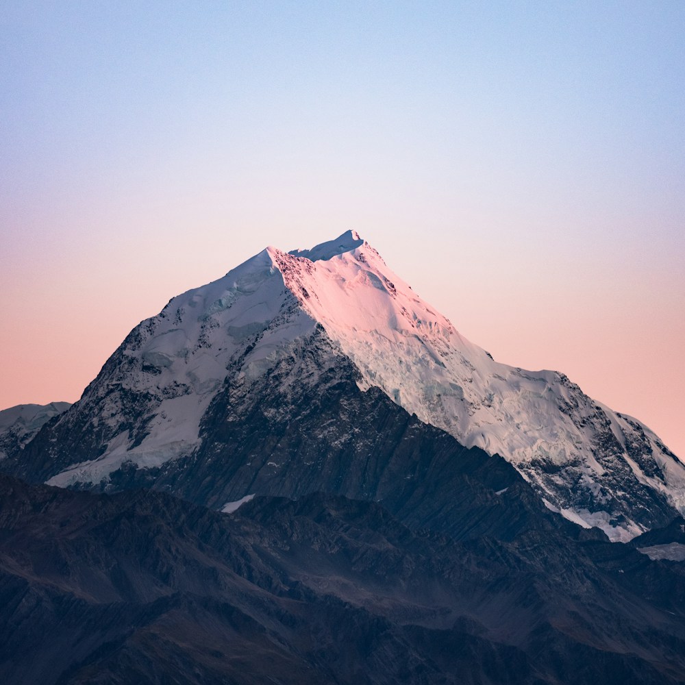
灰度-25
灰度-50
灰度
<img class="grayscale-0 ..." src="/img/mountains.jpg" /><img class="grayscale-25 ..." src="/img/mountains.jpg" /><img class="grayscale-50 ..." src="/img/mountains.jpg" /><img class="grayscale ..." src="/img/mountains.jpg" />使用自定义值
Use the grayscale-[<value>] syntax to set the grayscale based on a completely custom value:
<img class="grayscale-[0.5] ..." src="/img/mountains.jpg" />For CSS variables, you can also use the grayscale-(<custom-property>) syntax:
<img class="grayscale-(--my-grayscale) ..." src="/img/mountains.jpg" />This is just a shorthand for grayscale-[var(<custom-property>)] that adds the var() function for you automatically.
响应式设计
Prefix a filter: grayscale() utility with a breakpoint variant like md: to only apply the utility at medium screen sizes and above:
<img class="grayscale md:grayscale-0 ..." src="/img/mountains.jpg" />Learn more about using variants in the variants documentation.